 Armenian AI Company
The design language of AI: from terminal to cinema
A plain terminal has one ancestor: the teletype. The neo-terminal, now that the technology finally allows it, inherits all of text-on-a-surface at once — the book, the technical drawing, brutalism, the demoscene — and its endpoint is the seam where text fuses with photorealism.
Ask what AI looks like and most people picture a terminal: a dark rectangle, a blinking cursor, monospaced text arriving one line at a time. It is an understandable guess — the technology reached the public as language typed into a box — but the terminal is a poor likeness, because the terminal is thin. It descends from a single ancestor, the teletype, and it kept the teletype’s poverty: one typeface, one column of characters, no picture it could not spell out in punctuation. To mistake AI for that is to mistake it for a light switch with good manners. The interesting thing is what the text frame becomes once the hardware stops being poor — and what it becomes is not thinner but astonishingly rich.
Two terminals
There are two objects hiding under the one word. The first is the historical terminal: a teletype in a window, in Neal Stephenson’s phrase, “very close to the bottom of that stack.” It is austere because it had to be — a character grid and nothing else — and its austerity is exactly what lends it authority, the sense of the “real computer” beneath the graphical shell. A language model streaming text into a dark box borrows that authority wholesale. But a console UI full of monospaced output is a console UI whether or not any intelligence sits behind it; the terminal is a costume AI wears, not a description of what it is.
The second object is newer and far stranger. Call it the neo-terminal: a text-centred frame that keeps the prompt and the grid but, because raster graphics, GPU acceleration, and web rendering finally let it, can now hold anything text has ever lived inside. Kitty’s graphics protocol puts “arbitrary pixel graphics” inside a terminal emulator; iTerm2 renders inline images; Ghostty ships a chosen typeface and GPU compositing. The AI-coding wave lives here — Warp, Anthropic’s Claude Code, OpenAI’s Codex CLI.
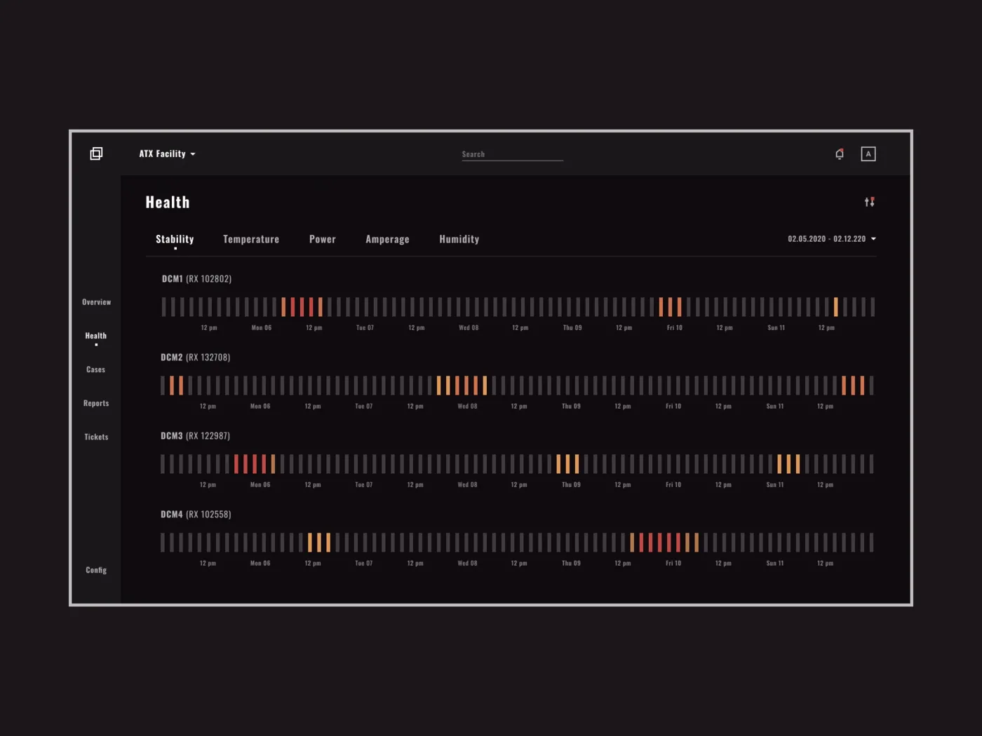
Here is the claim this paper turns on. The plain terminal inherited from one text tradition and stayed poor. The neo-terminal inherits from all of them — the book, the technical drawing, brutalism, the demoscene — because it is the first text frame with the technology to do so. What follows is an inventory of that inheritance, drawn from a corpus of design references, ending where the frame is headed: the fusion of text and photorealism in Figure 1.
From the book
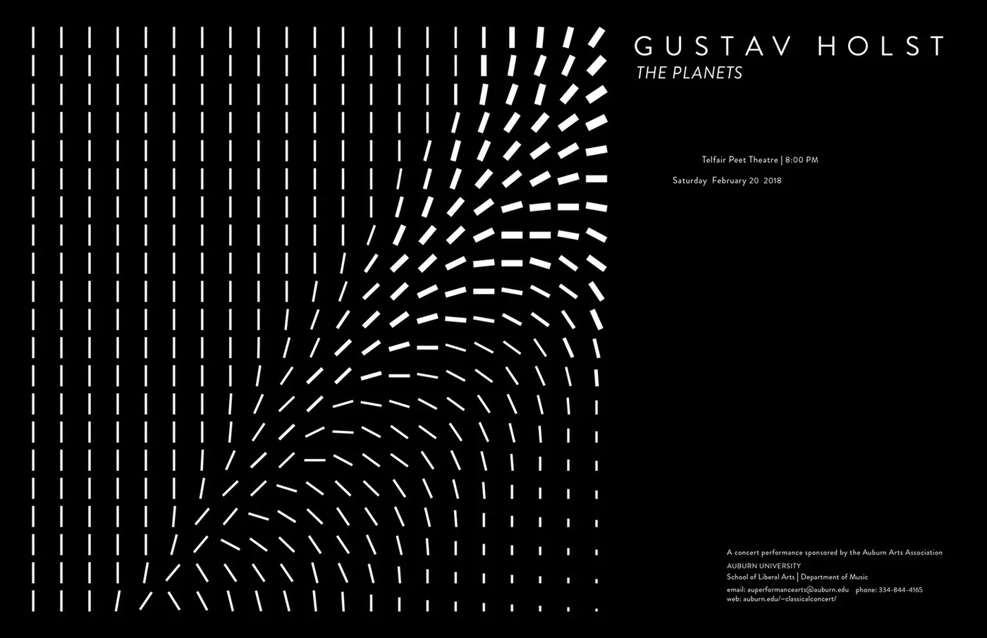
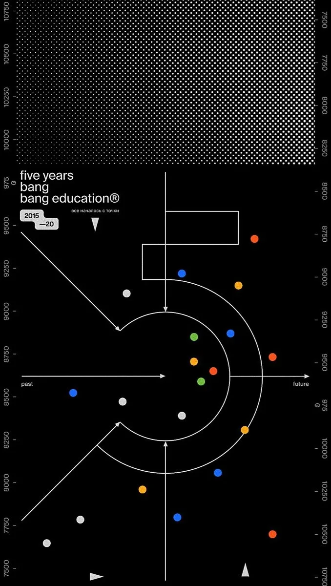
The first inheritance is the oldest: five centuries of typography and page layout. The neo-terminal does not set text the way a teletype did, in one weight of one monospaced face; it sets text the way a book does, with a hierarchy of faces, a considered measure, a grid borrowed from editorial design. The monospaced grid stops being a limitation and becomes a compositional choice — GitHub’s Monaspace treats code as a surface on which to “layer more meaning,” and Karin Wagner’s history of vernacular typography insists that “text is always an image that conveys meaning.”
From the drafting table
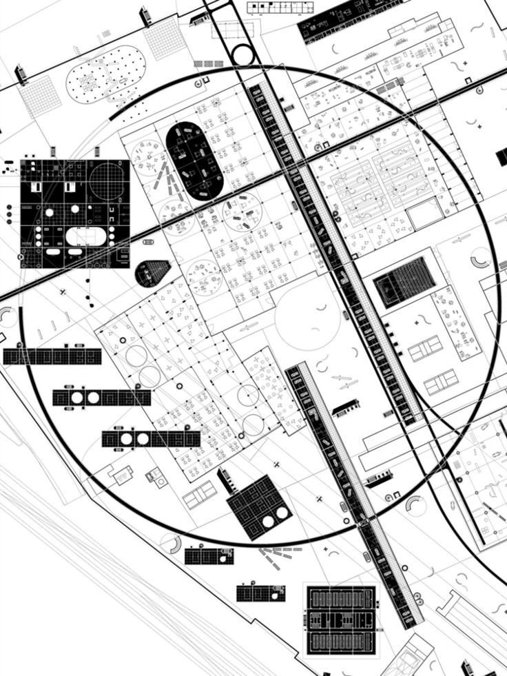
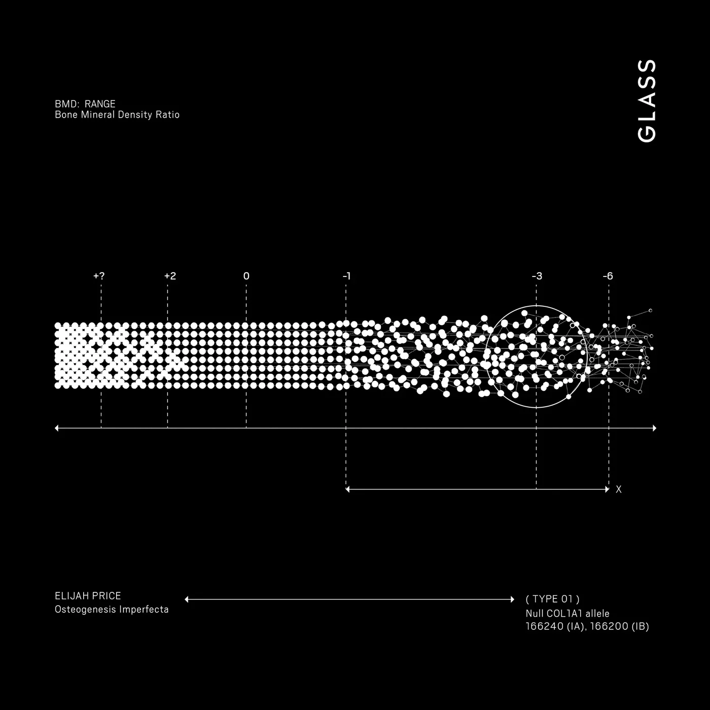
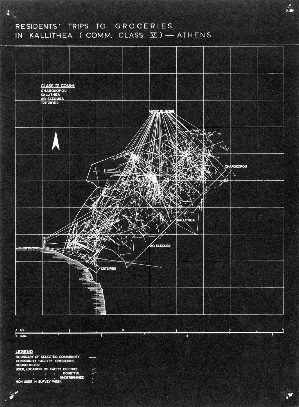
The second inheritance is the engineering drawing: the blueprint, the exploded diagram, the dimensioned schematic, the specification sheet. This is the aesthetic of mechanism made visible, and it is everywhere in AI design culture — not because these interfaces are technical drawings, but because the drawing signals inspectability, seriousness, and a candid account of how the thing works. The draft is back.
From brutalism and the node
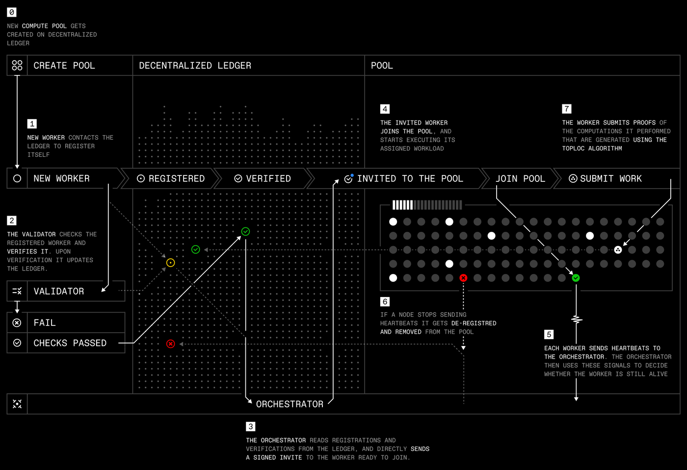
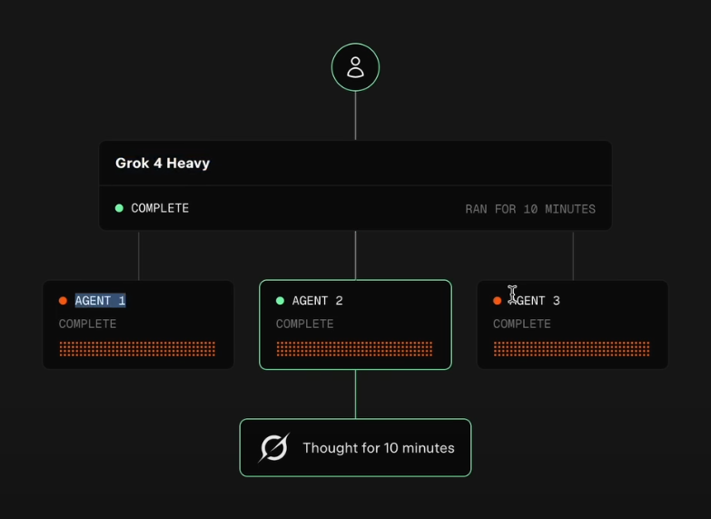
The third inheritance is structural: the raw, unornamented grid of web brutalism, and the node-and-edge diagram of the flowchart, the database schema, the dependency graph. Brutalism arrived partly as a revolt against template-driven polish; in AI interfaces it reads as machinery with the housing off. The node graph is its natural companion — a way to draw a system as what it is, boxes and the lines between them.
From the demoscene: the character as image
The fourth inheritance is the one the plain terminal came closest to but could never afford: the tradition of ASCII art, dot-matrix, and dithering — the character treated not as a letter but as a pixel, an element of an image. Where the teletype spelled things out, the neo-terminal draws with the grid, turning the glyph into a rendering primitive.
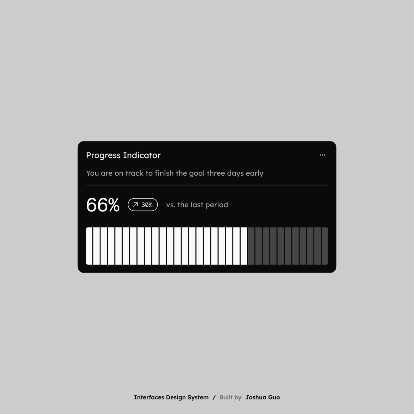
The union: text and photorealism in one frame
Add these inheritances up and a direction appears. Once a text frame can set a book, draw a schematic, render brutalist structure, and treat the character as a pixel, only one boundary is left: the boundary between the symbol and the photograph, the internal diagrammatic world and the external rendered one. For most of computing they took turns — you were in the spreadsheet or in the image. The most forward-looking references collapse that alternation, putting both in one frame without a change of regime. The clearest case renders the most external subject imaginable, a human body, in the internal world’s own medium.
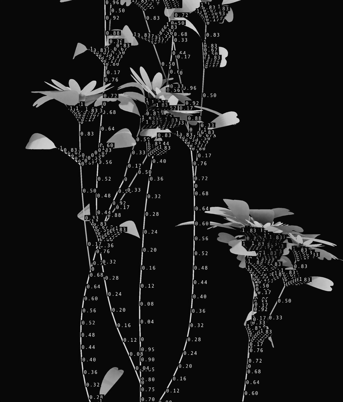
Figure 1, the hand on the fern, is the same move at full strength: living matter and engineering annotation in a single continuous shot, neither a labelled photograph nor an illustrated diagram but genuinely both at once. Modern terminal ecosystems make the collision literal at the infrastructure level, letting photographs sit inside the character grid; the design culture runs further, treating text and photorealism as one expressive material. This is the seam the plain terminal could never reach — and, strikingly, we found almost no writing that names it. It is the open problem in the design language of AI, and, we argue, its actual future.
Cinema got there first
The fusion has one prior home, and it is not a shipped machine. Lev Manovich’s account of the cultural interface notes that the screen is pulled three ways at once — dense information surface, window onto a virtual world, and instrument panel — a triad that maps onto chat transcript, simulated world, and control surface. Only cinema ever tried to hold all three in one shot: the heads-up display over a live scene, the readout floating in rendered space, the label burned onto a photoreal object. Film has been compositing text onto photorealism for a century, because a movie interface must be legible and beautiful at once.
Mark Coleran, who popularised the term FUI (fantasy user interface), warns that film screens are “diegetic props” — “It is not an interface. It was not designed to be used.” Cinema optimises for spectacle, usable software for reduction, and the two run in opposite directions. Yet the feedback loop is undeniable: Underkoffler’s Minority Report gestures went from MIT to the screen and back into product decks, and Her endures because it imagined assistance as ambient rather than as a screen. Shedroff and Noessel’s Make It So treats these fictions as a design archive; Axtell and Munteanu show Star Trek still shapes what people expect a computer to be. Real HCI history is not cinematic — Bush’s memex, Engelbart, Kay, Shneiderman gave us the shipped mechanisms — but expectation is cinematic. Cinema is where the union of text and photorealism was rehearsed until the hardware could finally perform it.
What the corpus shows
To keep the argument grounded, we assembled a corpus of 565 design references from contemporary AI-adjacent visual culture — the mood-board material designers circulate when deciding what AI “should look like” — and categorised each by dominant mode.
| Category | Count | Register |
|---|---|---|
| 3D render (photoreal / sculptural) | 186 | external |
| Product / app UI | 149 | external |
| Pattern / motif | 63 | connective |
| Terminal / TUI | 36 | internal |
| Editorial typography | 30 | connective |
| Data visualisation | 30 | internal |
| Movie / sci-fi UI | 23 | cinematic |
| Photography | 18 | external |
| ASCII / dot-matrix | 14 | internal |
| Map / technical diagram | 14 | internal |
| Logo / mark | 2 | — |
The rendered, external register dominates the board by roughly four to one over the internal, diagrammatic one — designers reach for photorealism to establish mood and desirability, and for the terminal, the draft, and the glyph to establish what the thing is. But the inheritances traced above cut across these categories rather than filling any single one, and the true unions — Figures 1, 12, 13 — are a small minority scattered among them. That scarcity is the finding. The neo-terminal is not yet a settled category with its own folder; it is a synthesis in progress, visible only when you stop sorting images into “text” and “picture” and start noticing how much of text culture the frame has quietly reabsorbed.
Two caveats. The corpus is a curated mood-board, not a probability sample of shipped products; its proportions describe aspiration, not market share. And categorisation assigned each reference its single dominant mode, which necessarily undercounts precisely the hybrids the argument cares about most.
The plain terminal was thin because it had one parent. The neo-terminal is rich because it has many: the book gave it typography, the drafting table gave it the diagram, brutalism gave it the bare grid, the demoscene gave it the character-as-pixel — and cinema, all along, was keeping the last promise, that text and photorealism could share a single frame. What changed is not taste but capacity: the text frame finally has the hardware to hold everything text has ever lived inside, and then one thing more, the photograph.
So the mistake is to take the terminal literally — to believe that because AI arrived as text it must stay a console. It arrived in the console’s clothing and is now outgrowing it in every direction at once. The future UI of AI is not text, and it is not photorealism. It is both, in the same place, in the frame that begins this essay: a hand on a living thing, annotated by the machine that finally understands what it is looking at.
References
- Manovich, L. The Language of New Media. MIT Press, 2001.
- Bolter, J.D. & Grusin, R. Remediation: Understanding New Media. MIT Press, 1999.
- Galloway, A.R. The Interface Effect. Polity, 2012.
- Chun, W.H.K. Programmed Visions: Software and Memory. MIT Press, 2011.
- Stephenson, N. In the Beginning… Was the Command Line. 1999.
- Weizenbaum, J. ELIZA. Communications of the ACM 9(1):36–45, 1966.
- Shneiderman, B. Direct Manipulation: A Step Beyond Programming Languages. IEEE Computer 16(8), 1983.
- Masson, D., Malacria, S., Casiez, G. & Vogel, D. DirectGPT: A Direct Manipulation Interface to Interact with Large Language Models. Proc. CHI, 2024.
- Wagner, K. From ASCII Art to Comic Sans: Typography and Popular Culture in the Digital Age. MIT Press, 2023.
- GitHub Next. Monaspace. 2023–. And Ghostty terminal documentation, ghostty.org.
- Fogg, B.J. et al. How Do Users Evaluate the Credibility of Web Sites? A Study with Over 2,500 Participants. Proc. DUX, ACM, 2003.
- Shedroff, N. & Noessel, C. Make It So: Interaction Design Lessons from Science Fiction. Rosenfeld Media, 2012.
- Coleran, M. Interview on pragmatic futurism and screen graphics. Pushing Pixels, 2021.
- Axtell, B. & Munteanu, C. Tea, Earl Grey, Hot: Designing Speech Interactions from the Imagined Ideal of Star Trek. Proc. CHI, 2021.
- The mind behind Minority Report is giving PowerPoint a sci-fi overhaul. Minority Report / John Underkoffler; Wired, 2019.
- Why Her will influence the future of UI design even more than Minority Report. Wired, 2013.
- Bush, V. As We May Think. The Atlantic, 1945.
- Engelbart, D. Augmenting Human Intellect: A Conceptual Framework. SRI, 1962.
- Sundar, A., Russell-Rose, T., Kruschwitz, U. & Machleit, K. The AI Interface: Designing for the Ideal Machine-Human Experience. 2024.
- Terminal graphics: Kitty graphics protocol; iTerm2 inline images; Textual framework documentation.
- AI terminal agents: Anthropic Claude Code; OpenAI Codex CLI; Warp — product documentation, 2026.
Figures are design references from the AAIC study corpus (565 items), reproduced here for scholarship and criticism. Where a creator is known they are credited; most are not. If a figure is yours, write to nano@aicompany.am for credit or removal.